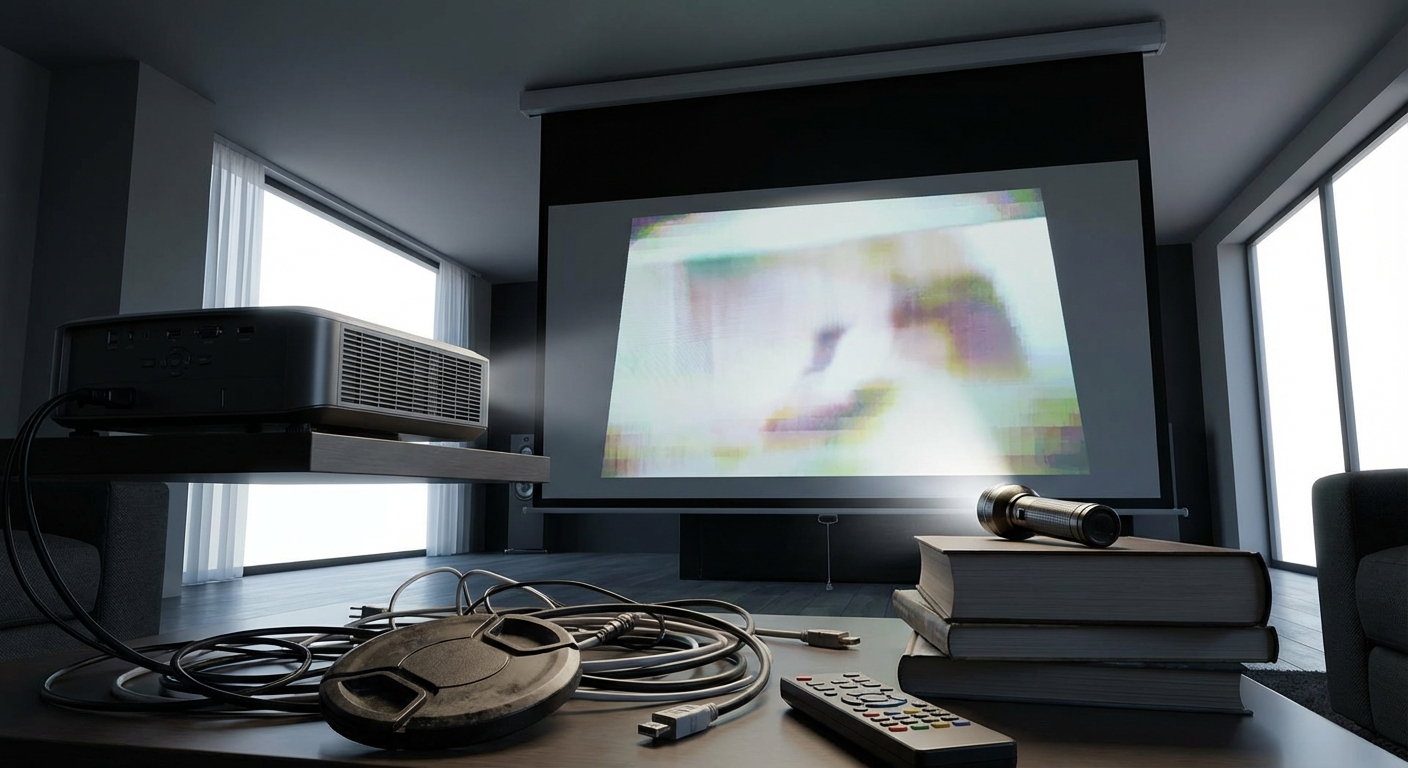
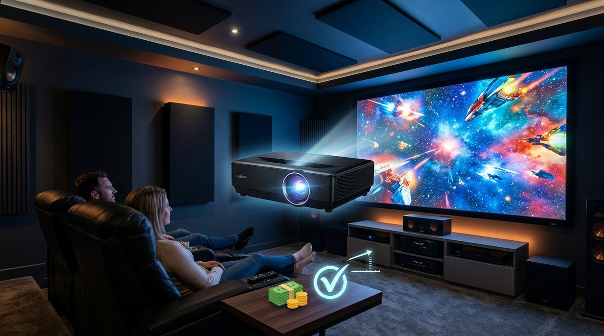
You finally got that projector you’ve been eyeing for months. You unbox it, mount it, fire it up, and… something’s off. The image looks washed out, blurry, or weirdly stretched. Sound familiar? Most picture quality problems don’t come from cheap gear. They come from setup errors that take five minutes to fix once you know what to look for.
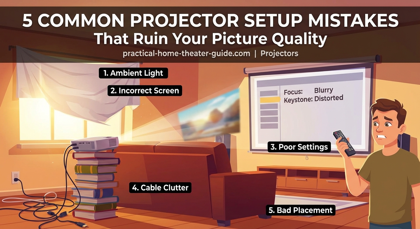
Most projector picture quality issues stem from five preventable setup errors: wrong throw distance, poor screen choice, incorrect picture mode, bad placement, and skipping calibration. Fixing these mistakes takes less than an hour but dramatically improves your viewing experience. This guide shows you exactly what to check and how to correct each problem step by step.
Wrong Throw Distance Destroys Sharpness
Throw distance is the space between your projector lens and screen. Get this wrong and your image will never look sharp, no matter how expensive your projector is.
Too close and you’ll see a zoomed-in, blurry mess. Too far and the image shrinks, forcing you to use digital zoom that kills detail.
Every projector has a throw ratio. A 1.5:1 ratio means you need 1.5 feet of distance for every foot of screen width. For a 100-inch screen (about 87 inches wide), you’d need roughly 130 inches, or about 11 feet.
Here’s how to get it right:
- Measure your screen width in inches
- Find your projector’s throw ratio in the manual or specs sheet
- Multiply screen width by the throw ratio
- Position your projector at that distance
Most projectors offer some zoom flexibility, but staying near the middle of that range gives you the sharpest image. Maxing out zoom in either direction softens the picture.
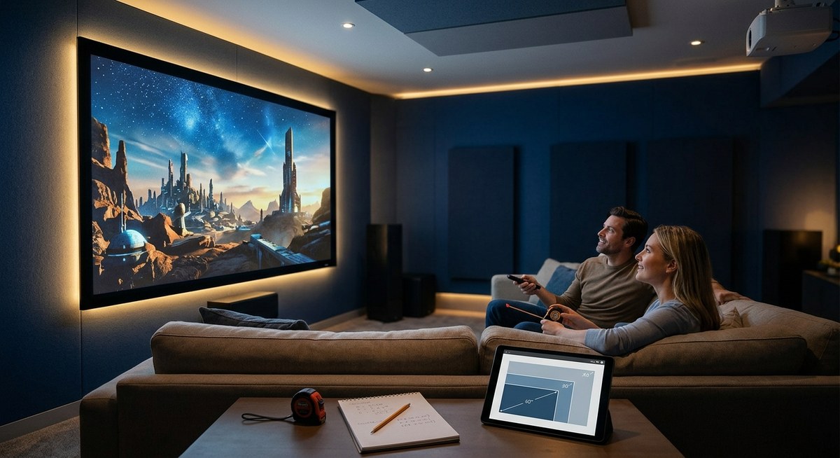
If you’re still planning your setup, how to calculate projector throw distance for your room size walks through the math with real room examples.
“I’ve seen people spend $2,000 on a projector and then mount it wherever the ceiling joist happens to be. Throw distance isn’t optional. It’s the foundation of good image quality.” – AV installer with 15 years of home theater experience
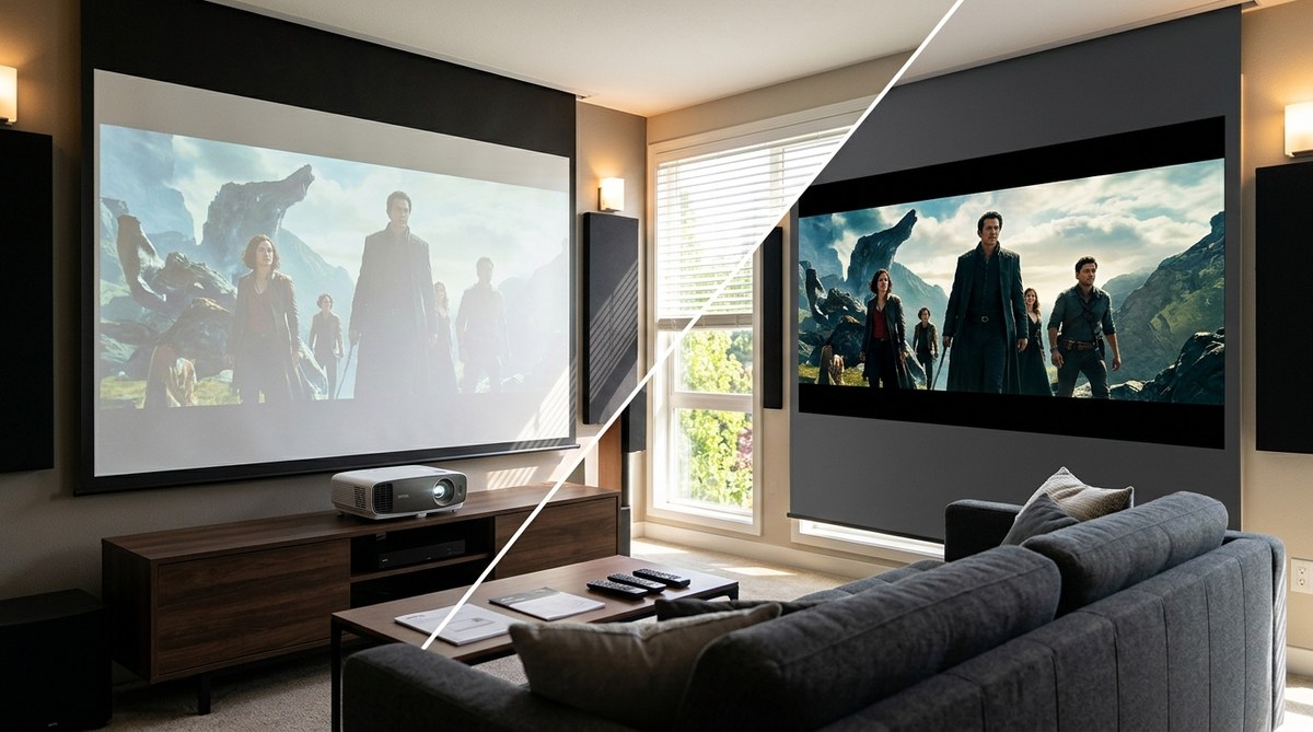
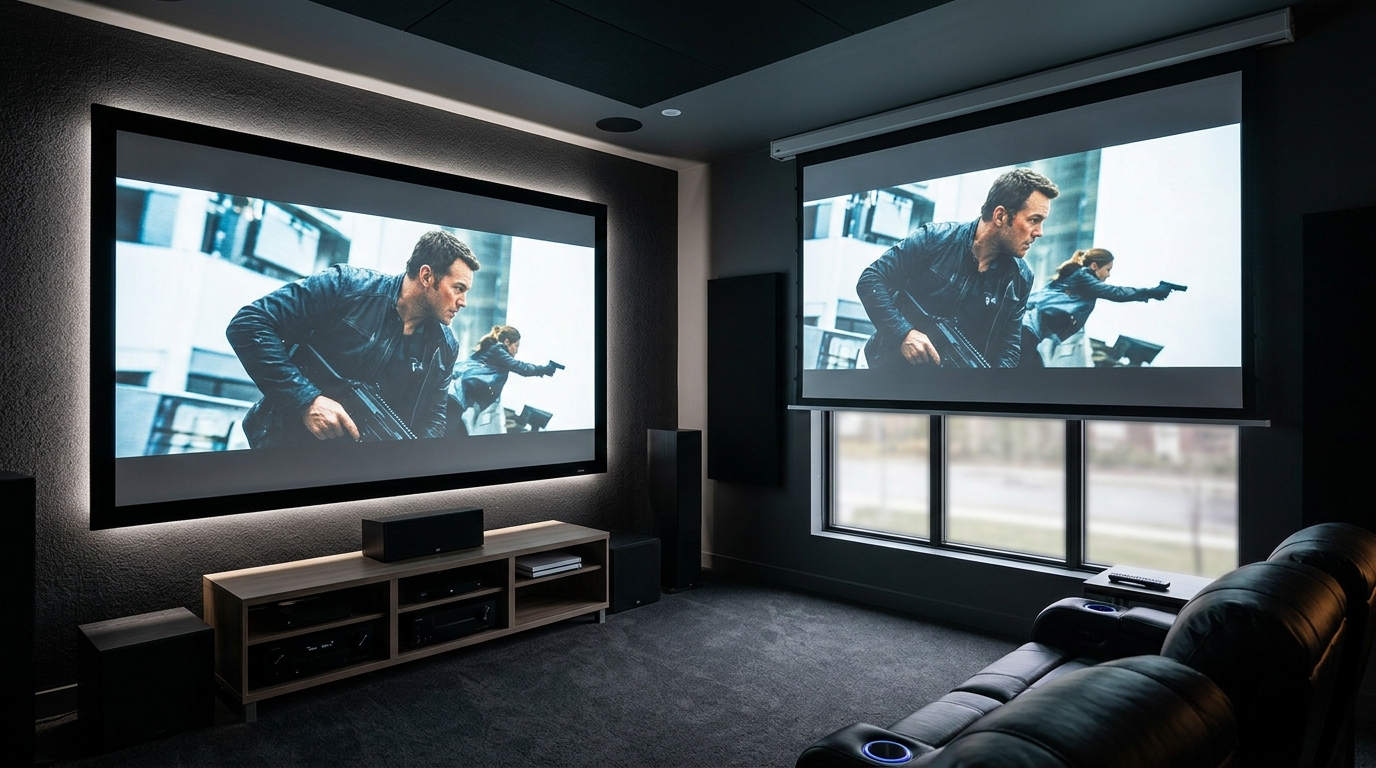
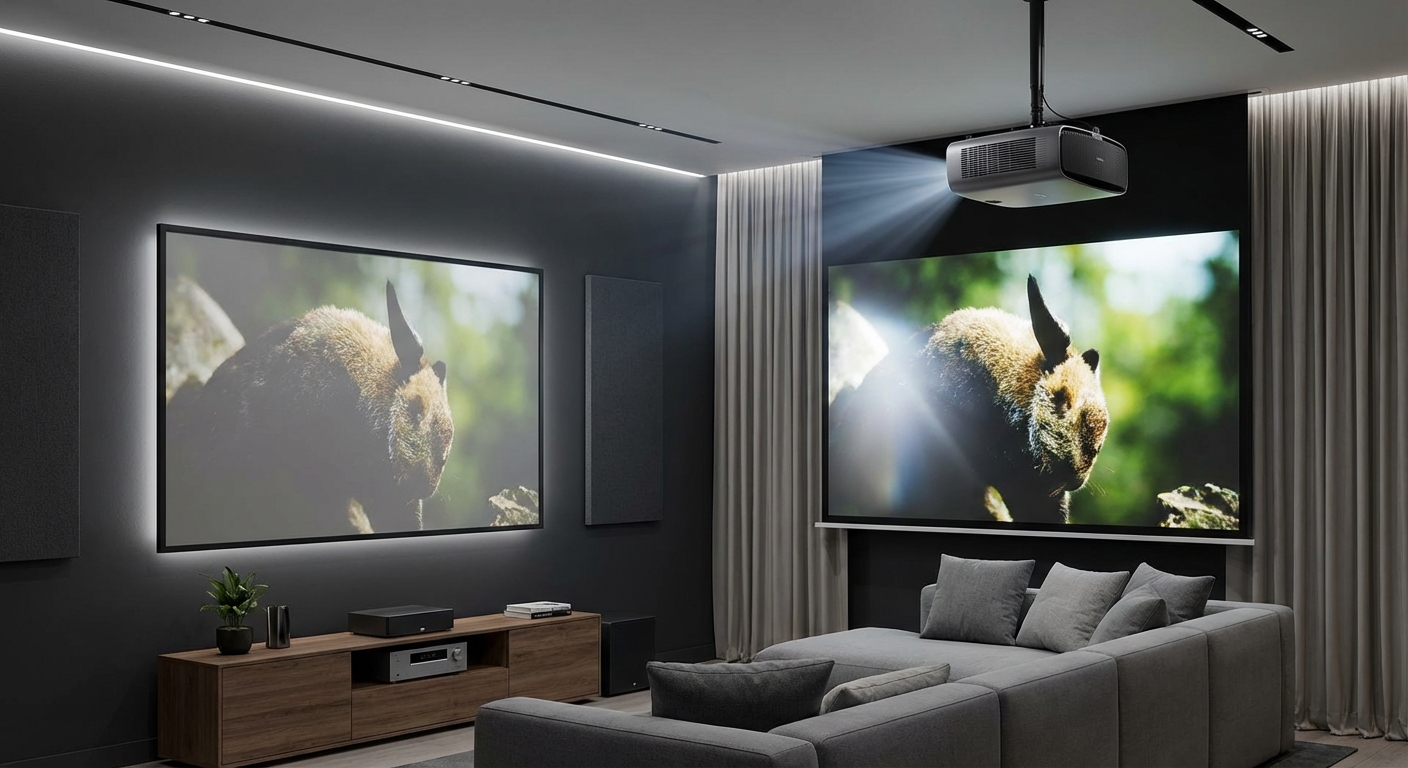
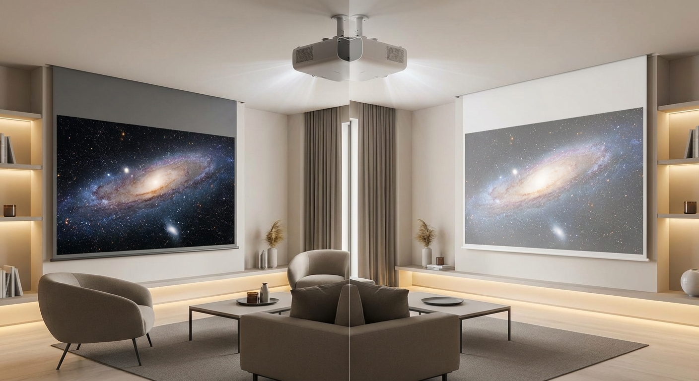
Projecting Onto the Wrong Surface Kills Contrast
Your wall might seem fine until you see the same content on an actual screen. Walls scatter light in every direction. Screens reflect it back to your eyes.
The difference shows up as washed-out blacks, muddy colors, and terrible performance in anything but total darkness.
Here’s what happens with common surfaces:
| Surface Type | Contrast Impact | Color Accuracy | Best Use Case |
|---|---|---|---|
| White wall | Poor, blacks look gray | Inconsistent, depends on paint | Emergency viewing only |
| Blackout cloth | Fair, better than wall | Good if material is smooth | Budget temporary setup |
| Matte white screen | Excellent for dark rooms | Very accurate | Dedicated theater rooms |
| Gray screen | Best for rooms with some light | Excellent | Living rooms, multi-use spaces |
| ALR (ambient light rejecting) screen | Good in bright rooms | Good to excellent | Rooms with windows, daytime viewing |
If you’re on a budget, a blackout cloth stretched tight beats a bare wall. But a proper screen makes a bigger difference than most gear upgrades.
Gray screens help in rooms where you can’t control all the light. They sacrifice a bit of peak brightness to give you darker blacks, which makes the overall image look punchier.
ALR screens cost more but let you watch during the day without closing every curtain. They use special materials that reject ceiling light while accepting light from the projector angle.
Leaving Picture Mode on “Vivid” Ruins Everything
Out of the box, most projectors ship in “Vivid,” “Dynamic,” or “Bright” mode. These settings crank every color to 11 and blast brightness to eye-searing levels.
They look impressive in a bright store. They look terrible in your home.
These modes crush detail in bright scenes, blow out skin tones, and make everything look like a cartoon. Reds turn neon. Blues go electric. Whites glare.
Switch to “Cinema,” “Movie,” or “Film” mode. These presets get you 80% of the way to accurate color without any tweaking.
Here’s what to adjust after switching modes:
- Brightness: Set so you can barely see the difference between the darkest black bar and true black on a test pattern
- Contrast: Raise until white details start to disappear, then back off slightly
- Color: Lower it. Seriously. Most people have this 20-30% too high
- Sharpness: Set to zero or very low. High sharpness creates edge halos that look awful
- Color temperature: Choose “Warm” or “Warm2” for accurate whites that don’t look blue
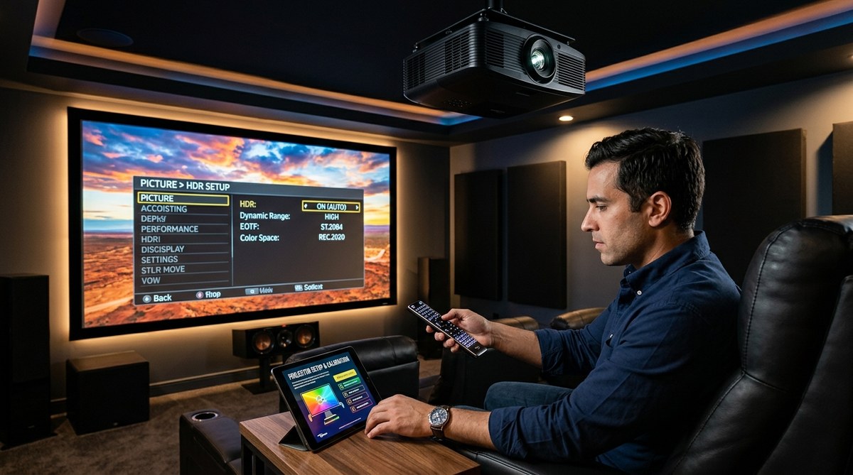
Most projectors also have dynamic iris, motion smoothing, and other processing features turned on by default. Turn them all off. They introduce lag, artifacts, and weird motion.
If you want perfect color, grab a calibration disc like Spears & Munsil or Disney WOW. They include test patterns that walk you through proper settings in about 20 minutes.
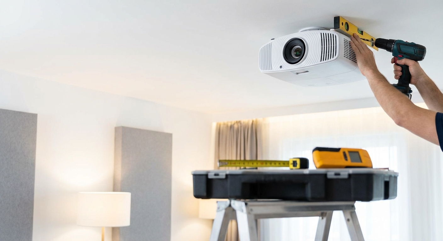
Bad Placement Causes Keystone and Distortion
Keystone happens when your projector isn’t perpendicular to the screen. The image comes out as a trapezoid instead of a rectangle.
Most projectors offer digital keystone correction. Don’t use it.
Digital keystone crops and stretches your image. You lose resolution and introduce scaling artifacts. A 1080p projector with heavy keystone correction might only display 720p worth of actual detail.
The fix is physical placement. Your projector lens should be:
- Centered horizontally on the screen
- At the right height for your model (some project above the lens, some below, some centered)
- Perfectly perpendicular to the screen surface
Use a level on top of the projector. Even a few degrees of tilt creates noticeable distortion.
If ceiling height forces you into a steep angle, look for a projector with lens shift. This feature moves the lens element mechanically, letting you adjust the image position without digital processing.
Lens shift maintains full resolution and image quality. It’s worth paying extra for if your room has placement constraints.
Wall color matters too. Dark walls reduce reflections that wash out your image. If you’re painting, go with dark gray or brown. Skip pure black unless you want the room to feel like a cave.
Skipping Calibration Leaves Performance on the Table
You’ve fixed the physical setup. You’ve switched to the right picture mode. But you’re still not getting everything your projector can deliver.
Factory settings aim for average rooms with average screens. Your room isn’t average.
Basic calibration takes 30 minutes and costs nothing if you use free patterns. Advanced calibration with a colorimeter runs about $300 for the meter or $400-600 for a professional calibration.
Start with these free adjustments:
- Download the AVS HD 709 test patterns (free)
- Load them on a USB drive
- Use the brightness pattern to set black level
- Use the contrast pattern to set white level
- Use the color bars to check if colors look natural
- Use the sharpness pattern to eliminate edge enhancement
Pay attention to the corners. If they’re softer than the center, your lens needs adjustment or your screen isn’t flat.
Check for color uniformity. Some projectors show a green or magenta tint in corners. Better models let you adjust this in service menus, but most people learn to live with minor tinting.
Lamp hours matter too. Projector bulbs dim over time. A lamp with 2,000 hours won’t look as bright as a new one, even at the same settings. Most projectors have a lamp hour counter in the menu. Plan to replace bulbs every 3,000-4,000 hours for best results.
If you want reference-level accuracy, a colorimeter like the X-Rite i1Display Pro lets you measure and adjust color precisely. The learning curve is steep, but the results beat any factory preset.
Light Control Makes or Breaks the Experience
Projectors need darkness. Even high-brightness models look washed out with lights on.
Ambient light does two things. It reduces contrast by raising black levels. And it desaturates colors by adding white light to everything.
A projector showing perfect blacks in darkness will show gray blacks with even one lamp on. The image doesn’t just get dimmer. It loses depth.
Here’s what actually works:
- Blackout curtains or shades on all windows
- Dimmable lights set to off during viewing
- Dark carpet or rugs to reduce floor reflections
- Dark furniture that won’t bounce light back to the screen
- Sconces or bias lighting behind the screen for eye comfort without washing out the image
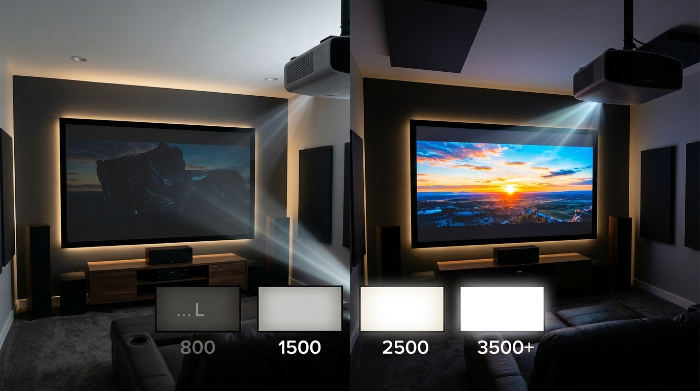
If you can’t get the room completely dark, you need more projector brightness or an ALR screen. Look for projectors rated at least 2,500 lumens for rooms with some ambient light.
The relationship between room size and light control matters too. Smaller rooms are easier to darken but also show reflections more. Larger rooms need more powerful projectors but give you more flexibility with light placement.
Time of day affects this. A room that’s perfect at night might be unwatchable at 2 PM. If you plan to watch during the day, test your light control at that time before finalizing your setup.
Your Projector Deserves Better Than Default Settings
These five mistakes account for 90% of disappointing projector experiences. The good news? You can fix all of them in an afternoon with no special tools.
Start with throw distance and placement. Get the projector in the right spot before you touch any settings. Then upgrade from that bare wall to at least a budget screen. Switch picture modes and turn off the processing features. Finally, spend 30 minutes with test patterns to dial everything in.
Your projector can probably deliver a much better picture than what you’re seeing right now. It just needs the right foundation.
Leave a Reply